Learn and master the art of How to Center a Form in CSS using 4 simple and effective methods: Flexbox, Grid, Margin, and Position properties.
When it comes to web development, aligning elements properly is crucial for creating modern, pleasing, and user-friendly interfaces.
One common challenge that web developers often face is centering a form HTML element on a web page.
Center a Form in Css
Here are the 4 basic methods to center an HTML form in css, there is an HTML code given at first, and then each method is explained separately.
HTML Form Markup
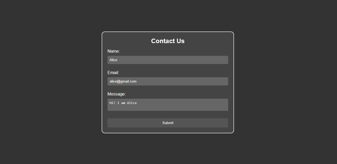
Before we dive into the CSS techniques for centering a form, let’s create a simple HTML form that we’ll use in the examples.
The following is a basic form with a few input fields and a submit button:
<!DOCTYPE html>
<html>
<head>
    <title>Centered Form Example</title>
    <link rel="stylesheet" href="styles.css">
</head>
<body>
    <div class="dark-container">
        <form class="dark-form">
            <h2>Contact Us</h2>
            <label for="name">Name:</label>
            <input type="text" id="name" name="name" required>

            <label for="email">Email:</label>
            <input type="email" id="email" name="email" required>

            <label for="message">Message:</label>
            <textarea id="message" name="message" required></textarea>

            <button type="submit">Submit</button>
        </form>
    </div>
</body>
</html>Code language: HTML, XML (xml)
Method 1: Using Flexbox
Flexbox is a powerful CSS layout model that simplifies centering elements and creating responsive designs.
Using Flexbox to center a form is an efficient and effective approach. Here’s how to do it:
/* CSS */

.dark-container {
    display: flex;
    justify-content: center;
    align-items: center;
    height: 100vh;
    background-color: #333;
}

.dark-form {
    width: 400px;
    padding: 20px;
    background-color: #444;
    border-radius: 16px;
    border: 2px solid #ccc;
}
Code language: CSS (css)
In this method, we create a container element with the class .dark-container and apply display: flex; to it.
The justify-content: center; and align-items: center; properties ensure both horizontally and vertically centered alignment of the form within the container.
All CSS code.
/* CSS */

* { box-sizing: border-box; }

body {
    font-family: 'Arial', sans-serif;
    margin: 0;
    padding: 0;
}

.dark-container {
    display: flex;
    justify-content: center;
    align-items: center;
    height: 100vh;
    background-color: #333;
}

.dark-form {
    width: 300px;
    padding: 20px;
    background-color: #444;
    border-radius: 16px;
    border: 2px solid #ccc;
}

.dark-form h2 {
    color: #fff;
    text-align: center;
    margin-bottom: 16px;
}

.dark-form label {
    display: block;
    color: #fff;
    margin-bottom: 5px;
}

.dark-form input[type="text"],
.dark-form input[type="email"],
.dark-form textarea {
    width: 100%;
    padding: 8px;
    margin-bottom: 18px;
    background-color: #666;
    color: #fff;
    border: none;
    border-radius: 4px;
}

.dark-form textarea {
    resize: vertical;
}

.dark-form button {
    width: 100%;
    padding: 10px;
    background-color: #555;
    color: #fff;
    border: none;
    border-radius: 4px;
    cursor: pointer;
    transition: background-color 0.3s;
}

.dark-form button:hover {
    background-color: #666;
}
Code language: CSS (css)
Method 2: Using Grid Layout
CSS Grid Layout is another powerful tool that enables the creation of complex layouts with ease.
To center a form using CSS Grid, follow these steps:
/* CSS */

* { box-sizing: border-box; }

.dark-container {
    display: grid;
    place-items: center;
    height: 100vh;
    background-color: #333;
}

.dark-form {
    width: 400px;
    padding: 20px;
    background-color: #444;
    border-radius: 16px;
    border: 2px solid #ccc;
}
Code language: CSS (css)
By setting display: grid; on the container element with the class .dark-container and applying place-items: center;, we achieve both horizontal and vertical centering of the form.
Whole Combined CSS
/* CSS */

* { box-sizing: border-box; }

body {
    font-family: 'Arial', sans-serif;
    margin: 0;
    padding: 0;
}

.dark-container {
    display: grid;
    justify-content: center;
    align-items: center;
    height: 100vh;
    background-color: #333;
}

.dark-form {
    width: 300px;
    padding: 20px;
    background-color: #444;
    border-radius: 16px;
    border: 2px solid #ccc;
}

.dark-form h2 {
    color: #fff;
    text-align: center;
    margin-bottom: 16px;
}

.dark-form label {
    display: block;
    color: #fff;
    margin-bottom: 5px;
}

.dark-form input[type="text"],
.dark-form input[type="email"],
.dark-form textarea {
    width: 100%;
    padding: 8px;
    margin-bottom: 18px;
    background-color: #666;
    color: #fff;
    border: none;
    border-radius: 4px;
}

.dark-form textarea {
    resize: vertical;
}

.dark-form button {
    width: 100%;
    padding: 10px;
    background-color: #555;
    color: #fff;
    border: none;
    border-radius: 4px;
    cursor: pointer;
    transition: background-color 0.3s;
}

.dark-form button:hover {
    background-color: #666;
}
Code language: CSS (css)
Method 3. Using Position Absolute
/* CSS */

*{ box-sizing: border-box; }

body {
    font-family: 'Arial', sans-serif;
    margin: 0;
    padding: 0;

}

.dark-container {
    width: 100%;
    height: 100vh;
    background-color: #333;
    position: relative;
}

.dark-form {
    width: 300px;
    padding: 20px;
    background-color: #444;
    border-radius: 8px;
    border: 2px solid #ccc;
    position: absolute;
    top: 50%;
    left: 50%;
    transform: translate(-50%, -50%);
}

.dark-form h2 {
    color: #fff;
    text-align: center;
    margin-bottom: 20px;
}

.dark-form label {
    display: block;
    color: #fff;
    margin-bottom: 5px;
}

.dark-form input[type="text"],
.dark-form input[type="email"],
.dark-form textarea {
    width: 100%;
    padding: 8px;
    margin-bottom: 10px;
    background-color: #666;
    color: #fff;
    border: none;
    border-radius: 4px;
}

.dark-form textarea {
    resize: vertical;
}

.dark-form button {
    width: 100%;
    padding: 10px;
    background-color: #555;
    color: #fff;
    border: none;
    border-radius: 4px;
    cursor: pointer;
    transition: background-color 0.3s;
}

.dark-form button:hover {
    background-color: #666;
}
Code language: CSS (css)
Explanation: We added position: relative; to the .dark-container class to set it as the positioning context for the child elements.
Then, we added position: absolute; to the .dark-form class, which allows us to position the form precisely relative to its containing element.
The combination of top: 50% left: 50% positions the form’s top-left corner at 50% of the container’s width and height.
The transform: translate(-50%, -50%); moves the form back by 50% of its own width and height, effectively centering it both horizontally and vertically.
Method 4: Using Margin Auto
One of the simplest and widely used methods to center a form is by utilizing the margin property in CSS.
This method involves setting the top and bottom margins of the form to “auto” and setting the left and right margins to a value of “auto” as well. Here’s how it works:
/* CSS */

*{
 box-sizing: border-box;
}
.dark-form {
    width: 400px;
    padding: 20px;
    background-color: #444;
    border-radius: 8px;
    border: 1px solid #ccc;
    margin: auto;
}
Code language: CSS (css)
In this example, we set the width of the form to 400px providing a fixed width.
The margin: auto; rule automatically calculates and distributes equal margins on the left and right, effectively centering the form within its container.
Why Centering a Form Matters
A well-centered form enhances the overall visual appeal of a webpage and improves the user experience.
When a form is placed at the center of a page, it naturally draws the user’s attention, making it more accessible and inviting.